
THE BRIEF & THE MODERN UTILITY
The initial request was to develop a name, logo, and comprehensive brand identity for a new category-defining demi-fine jewellery brand founded by Niyati and Shashant.
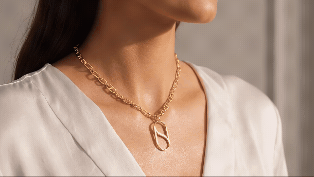
NIYANSA is built on a specific, powerful premise: freeing the modern Indian woman from "gold dependency"; the cultural habit of buying heavy, traditional pieces that sit locked in a safe. Instead, the founders engineered a highly functional, modular jewellery system. Built around a "One Base, Many Looks" philosophy, the pieces allow women to seamlessly transition their style from day to night. By simply swapping functional charms and add-ons on a single base chain or hoop, the jewellery adapts to multiple environments - from minimalist office elegance to evening wear.
However, we immediately faced a modern branding reality: legible, uncompromised 4-to-6 letter '.com' domains are effectively exhausted. Rather than resorting to misspelled tech-startup names or forced portmanteaus, I used this constraint as a strategic pivot. We expanded our search to 7 and 8-letter names, purposefully aiming for a phonetic weight that sounded like an established "Heritage House" rather than a fleeting trend. This perfectly matched their positioning: moving women away from fast fashion toward intelligent, long-lasting daily luxury.
NIYATI (Fate) + ANSA (The Loop) = NIYANSA
THE NAMING STRATEGY: THE PERFECT BALANCE
In searching for a unique conceptual hook, I extracted a "Golden Key" from the founders' names. By reassembling the core letters of Shashant, I discovered the root word ANSA. Coincidentally, in Latin, Ansa translates literally to "The Loop" or "The Handle."
This was a perfect metaphor for their product: a modular link system relying on strong, dependable connections.
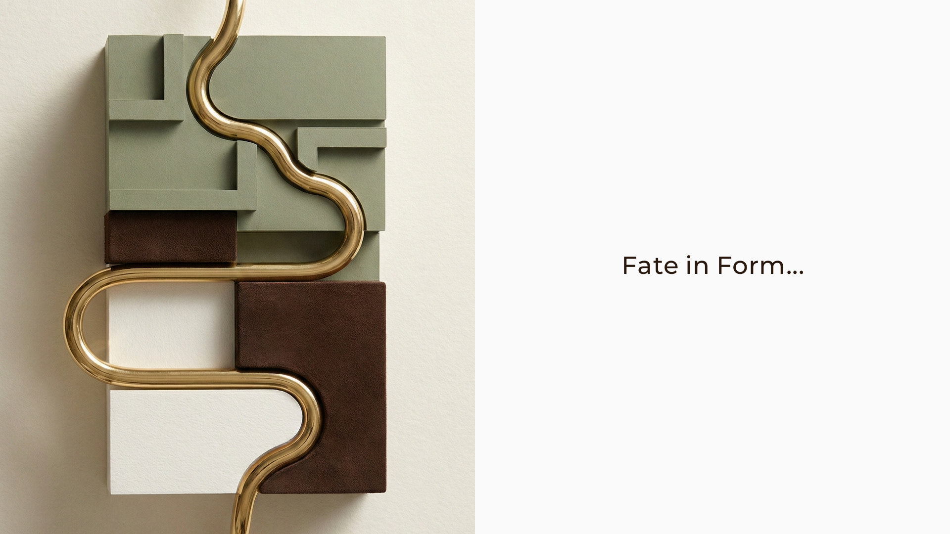
But the true magic of the name lies in the fusion. In Sanskrit and Hindi, Niyati translates to "Destiny" or "Fate." The final name, NIYANSA (Niyati + Ansa), is "The Perfect Balance." It gave birth to the brand's entire core philosophy: "Fate in Form." It bridges the intangible, emotional concept of destiny (Niyati) with the engineered, physical strength of the jewellery's structural loops (Ansa).
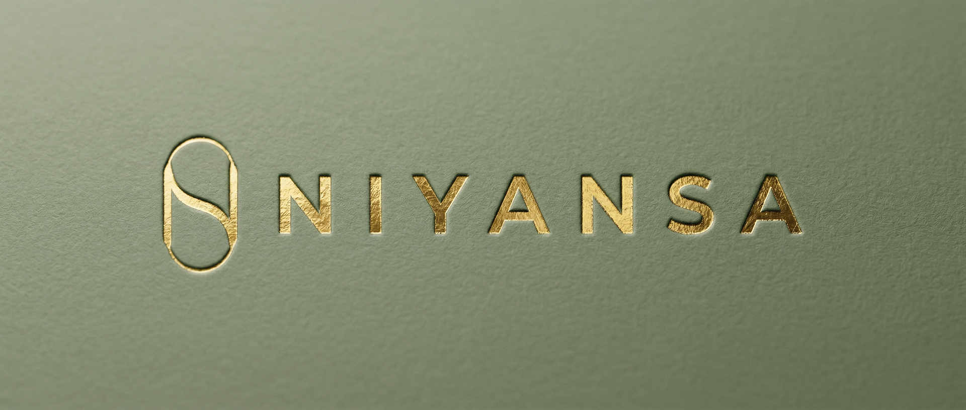
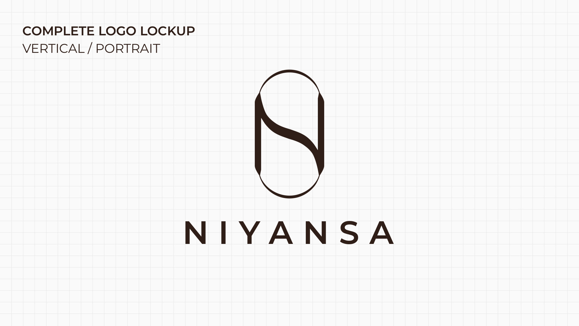
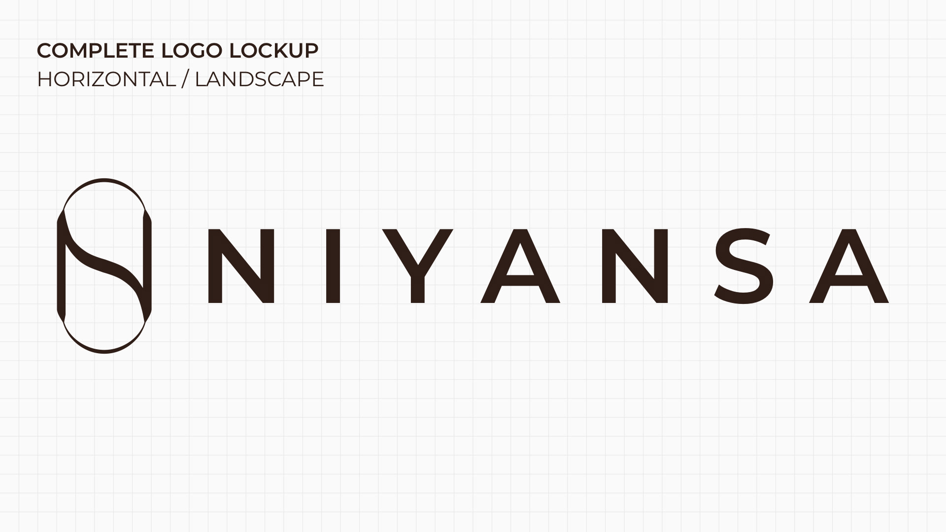
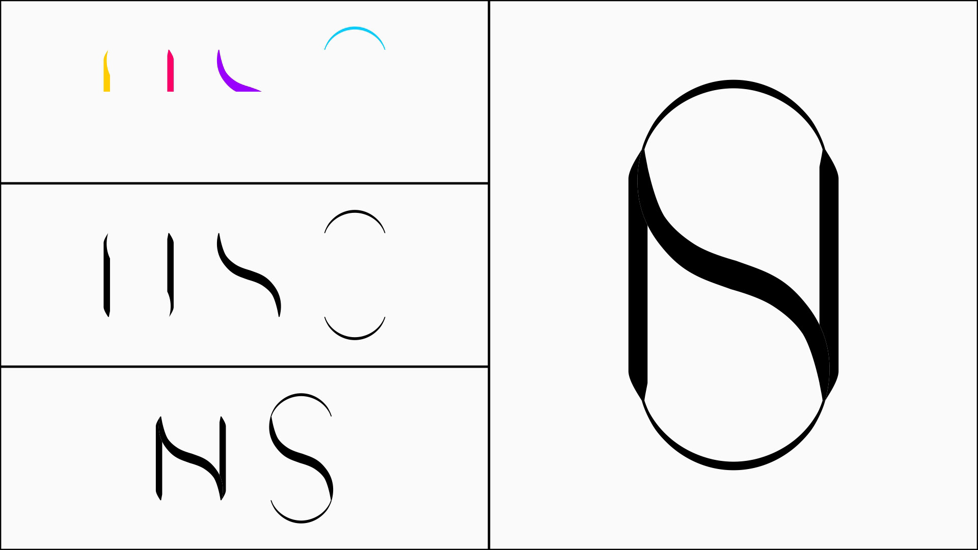
THE MARK: THE "VELVET DAGGER" EXECUTION
Because the brand name is rooted in Ansa (The Loop), it was crucial that the logomark translated flawlessly into a 3D physical object; capable of acting as a functional clasp, hallmark, or charm mechanism.
The interlocking 'NS' monogram executes a visual strategy I call the "Velvet Dagger":
The Dagger (Structure): The architectural integrity and engineered precision of the 'N' (and the Ansa mechanism).
The Velvet (Flow): The fluid grace of the 'S', representing soft luxury.
By mathematically constructing the mark within a contained crest, it draws upon the "Heirloom Revival" movement. It looks like a modern family seal, instantly signaling that NIYANSA is an investment in daily luxury, designed to last decades.

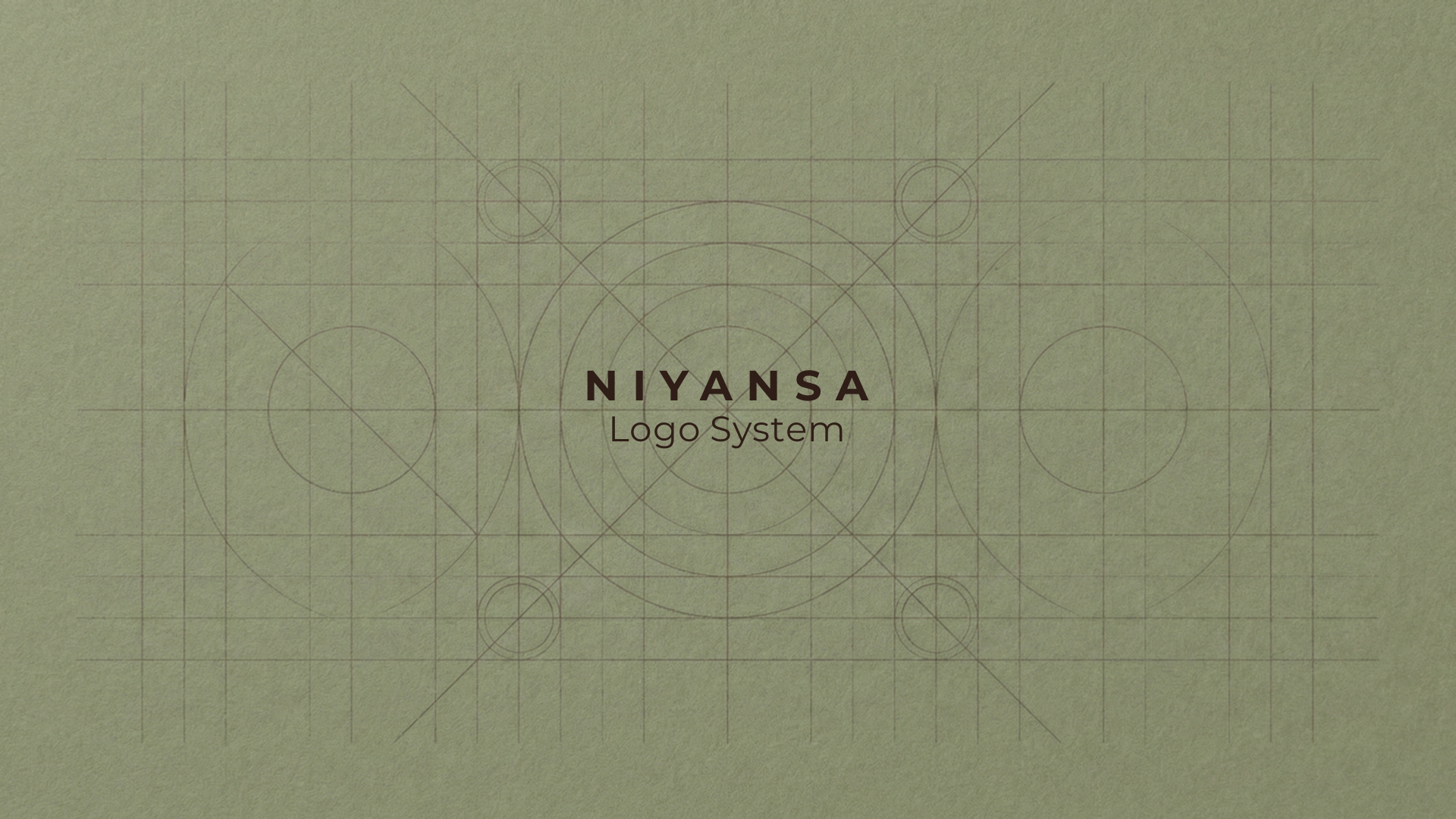
CONSTRUCTION / DECONSTRUCTION


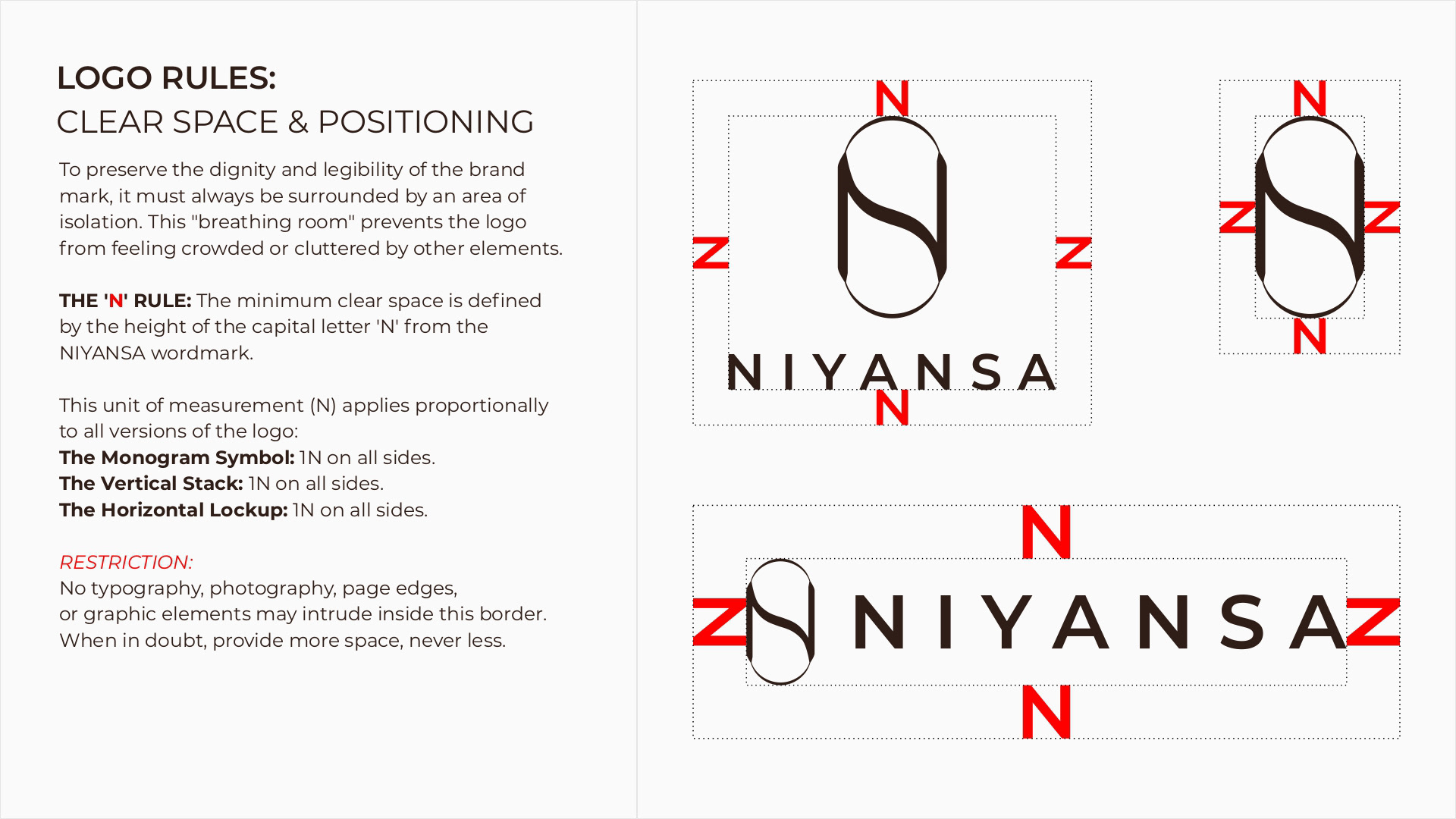
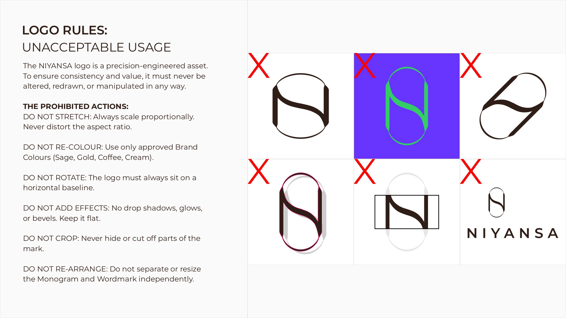
LOGO RULES
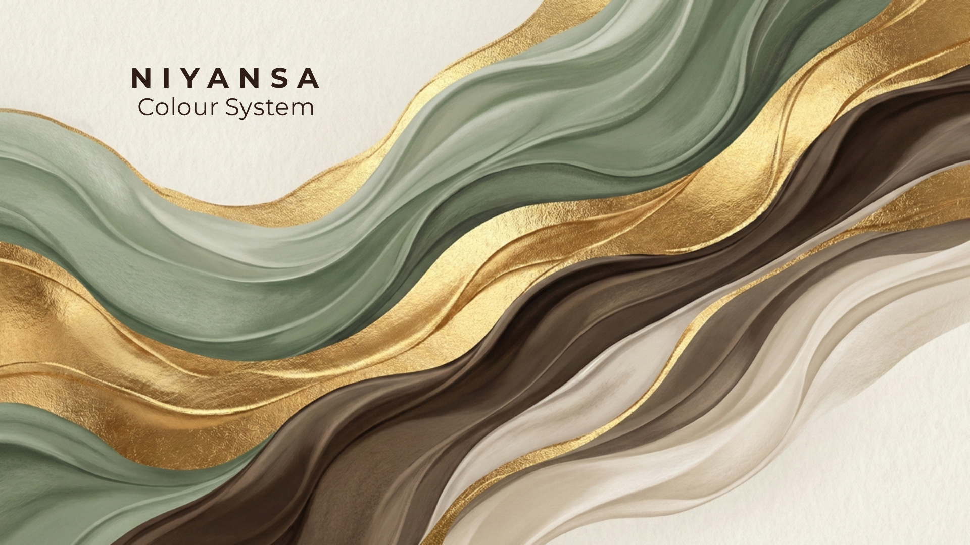
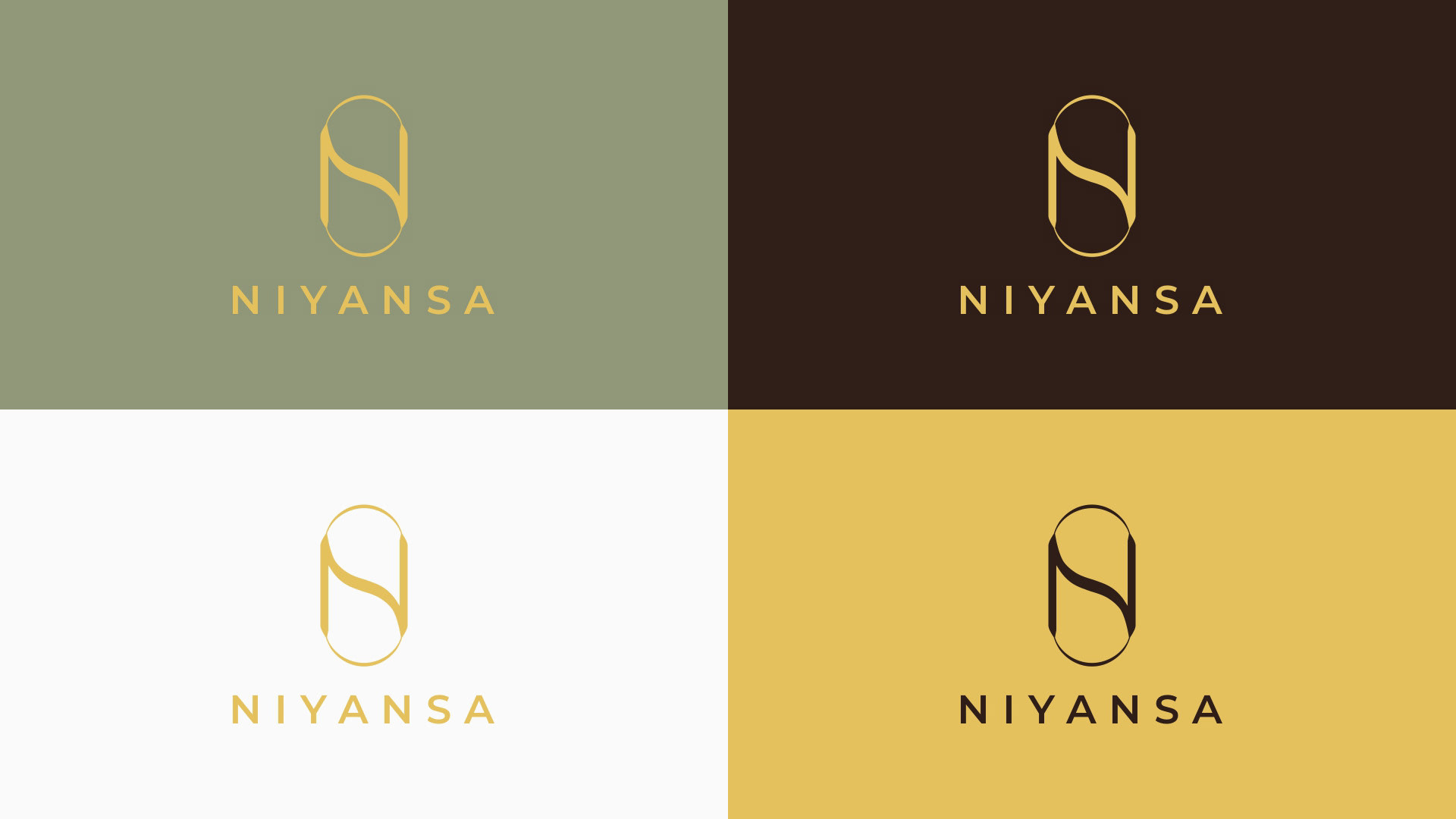
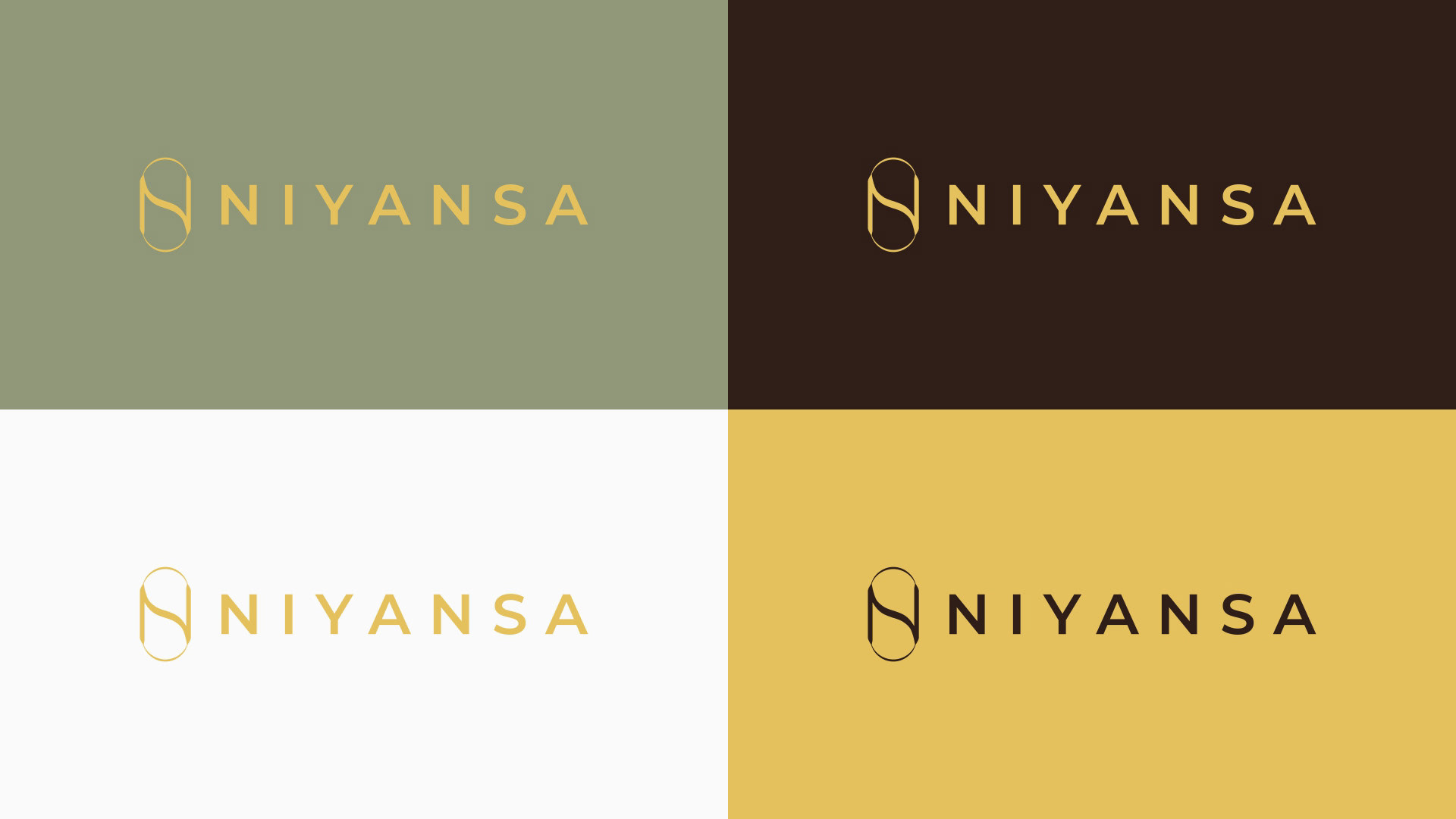
THE MATERIAL PALETTE
The colour system rejects standard black and white in favor of a richer, more tactile palette that complements gold plating:
Mineral Sage (Primary): The core visual expression. Calm, grounded, and contemporary.
Cool Coffee (Text & Anchor): Replaces black. It provides hierarchy and trust.
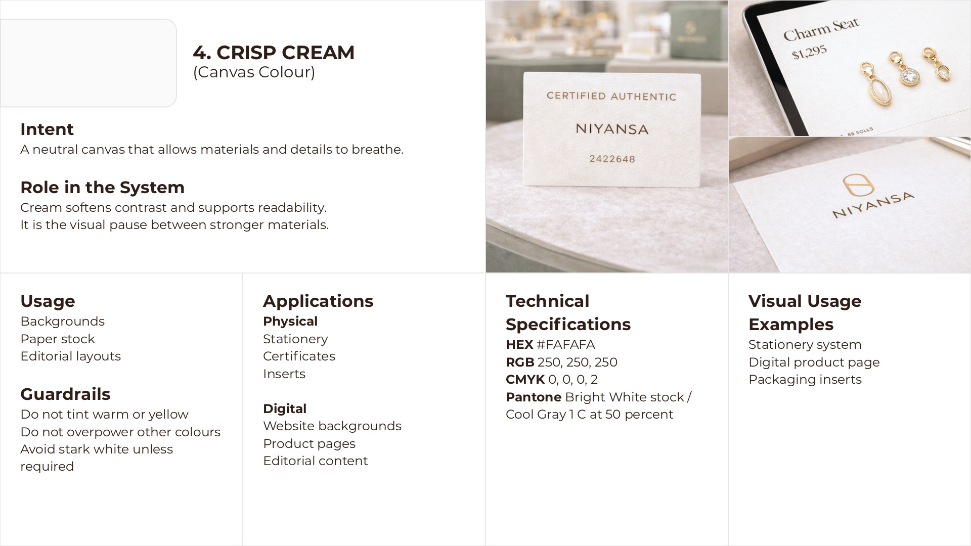
Crisp Cream (Canvas): A neutral canvas that allows materials and details to breathe.
High Polish Gold (Accent): A signal of value and crafted detail, used strictly for material emphasis like foiling.


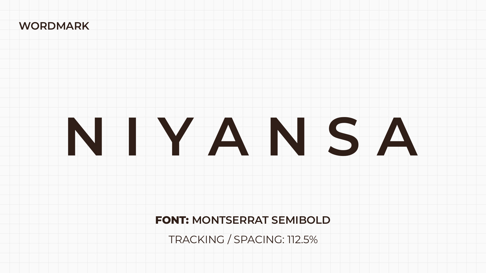
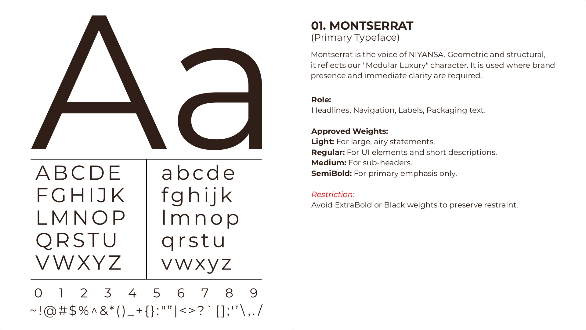
THE TYPOGRAPHY SYSTEM
Type supports clarity and hierarchy, never competing with the jewellery itself.
Primary (Montserrat): Geometric and structural, it serves as the confident brand voice for headings, e-commerce navigation, and packaging.
Secondary (Source Serif 4): Provides a warm, human contrast, adding editorial depth to long-form content, care cards, and the brand's storytelling blog.

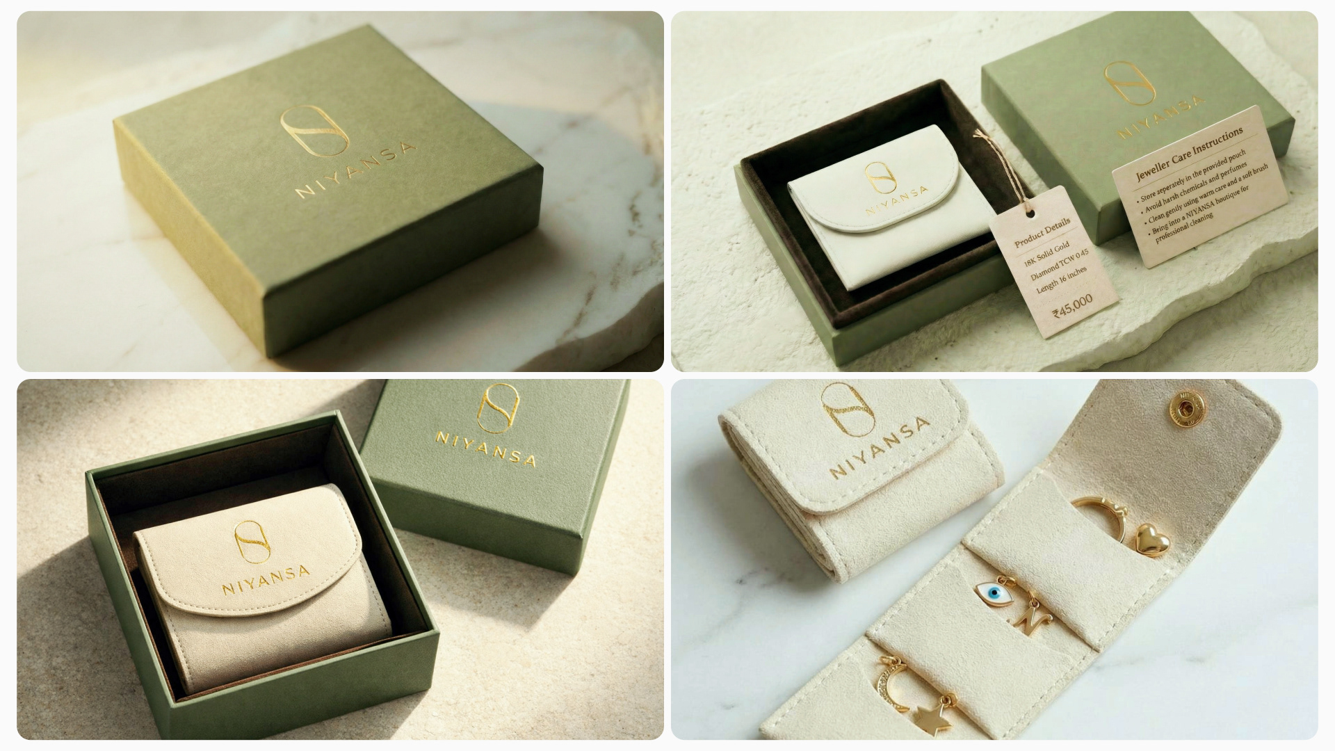
TACTILE LUXURY: THE PACKAGING EXPERIENCE
The brand experience culminates in its physical touchpoints. The packaging transitions from the architectural protection of rigid Mineral Sage boxes to the soft intimacy of the interior. A custom Crisp Cream suede tri-fold wallet pouch with internal storage slots and a gold snap button. The NIYANSA monogram and wordmark are finished in High Polish Gold foil, creating a premium unboxing experience that customers want to keep and reuse for travel.

Scope: Brand Strategy, Naming, Logo Design, Visual Identity System, Packaging Design.
Designed by: Arjun K. Sahdev | Website: arjunsahdev.com